
Revamping your home's exterior can breathe new life into its appearance and boost its overall appeal.
One of the most effective ways to achieve this transformation is by experimenting with color.
Whether you prefer bold, vibrant tones or subtle, neutral shades, the right color combinations can make a striking difference.
Discover how these expertly curated palettes can instantly enhance your curb appeal and elevate your home's unique character.
Let's explore these ten exceptional color combinations and find the perfect palette for your space.
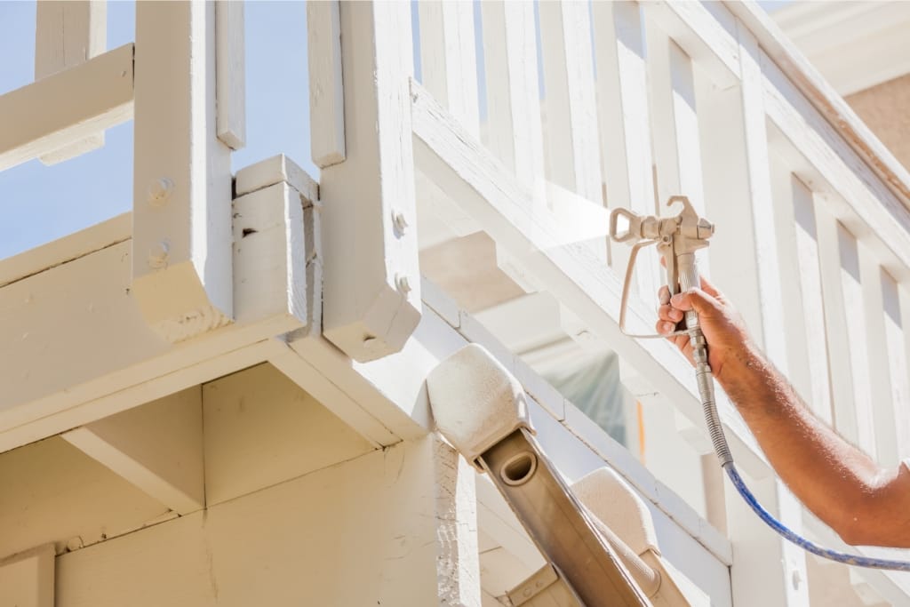
1)) Timeless White And Classic Black
Combining timeless white with classic black offers a sophisticated and elegant look that never goes out of style.
This high-contrast pairing creates a clean and contemporary aesthetic, perfect for modern and traditional homes alike.
White serves as a bright, airy backdrop, highlighting architectural features and making outdoor spaces feel more expansive.
Accents in black, such as window frames, shutters, or doors, add depth and definition, drawing the eye to focal points and enhancing the overall design.
This monochrome duo delivers a chic and polished exterior, allowing your home's charm to shine through with confidence and elegance.
Opting for timeless white and classic black ensures enduring curb appeal that transcends trends.
2)) Bold Red And Neutral Gray
Pairing bold red with neutral gray creates a captivating and dynamic look that exudes energy and sophistication.
The striking intensity of red adds a vibrant pop that instantly draws attention, making it an ideal choice for those looking to make a bold statement.
In contrast, neutral gray acts as a calming counterbalance, providing stability and grounding to the overall color scheme.
This combination works beautifully on a variety of architectural styles, from contemporary to traditional, adding warmth and character to the exterior.
Red accents on doors, trim, or front-facing elements can elevate the visual interest, while gray undertones ensure the design remains balanced and cohesive.
Choosing bold red and neutral gray results in a curb appeal that is memorable, stylish, and uniquely yours.
3)) Warm Terracotta And Soft Cream
Embracing warm terracotta alongside soft cream creates an inviting and cozy ambiance that resonates with timeless charm and natural beauty.
Terracotta's earthy richness is reminiscent of sun-baked clay, drawing from natural landscapes to impart a sense of warmth and connection with the environment.
When paired with soft cream, the result is a gentle but impactful contrast that brightens the overall aesthetic without overpowering it.
This harmonious blend is well-suited to Mediterranean-style homes or any residence seeking to evoke a rustic yet elegant feel.
Soft cream provides a serene and neutral backdrop that enhances terracotta's inherent warmth, allowing the colors to complement each other seamlessly.
By choosing warm terracotta and soft cream, you infuse your home's exterior with an enduring allure that captivates and welcomes.
4)) Bright Yellow And Deep Blue
A fusion of bright yellow and deep blue brings a vibrant and uplifting energy to your home's exterior, reminiscent of a sunny sky meeting a tranquil ocean.
This lively combination creates a cheerful and welcoming vibe, perfect for homeowners who want to inject a sense of playfulness and positivity into their curb appeal.
Bright yellow works as a captivating focal point, drawing attention to entryways or decorative details, while deep blue provides a grounding and sophisticated counterpoint.
The richness of the blue not only accentuates the brightness of the yellow but also offers a calming balance, ensuring the overall design remains cohesive and pleasant to the eye.
Embracing bright yellow and deep blue guarantees a striking and harmonious facade that leaves a lasting impression.
5)) Serene Green And Elegant Taupe
Blending serene green with elegant taupe crafts a tranquil and sophisticated exterior that pays homage to nature's calming hues and understated elegance.
Serene green evokes a sense of peace and harmony, reminiscent of lush gardens and soothing landscapes, while elegant taupe introduces a muted, earthy tone that adds depth and refinement.
Together, these colors create a balanced palette that transitions gracefully between seasons, enhancing any home's visual appeal.
This duo is particularly effective for those seeking a timeless design that feels both warm and welcoming.
Accents of taupe on trim or siding provide a subtle contrast to the lush green, ensuring a harmonious design that feels effortlessly cohesive.
Choosing serene green and elegant taupe showcases your home in a gentle yet distinguished manner, promising a curb appeal that's both calming and chic.
6)) Moody Navy And Crisp White
Moody navy paired with crisp white delivers a stunning and sophisticated look, reminiscent of a classic nautical theme yet imbued with a modern touch.
The deep, rich tones of navy provide a dramatic and luxurious feel, while crisp white accents introduce brightness and clarity, creating a refreshing contrast.
This pairing is perfect for those who appreciate a balanced design that exudes both strength and elegance.
Ideal for coastal or urban settings, moody navy can be used for larger surfaces like walls or trim, while white serves as the perfect complement on window frames or doors, enhancing the structure's architectural features.
Selecting moody navy and crisp white ensures your home's exterior makes a timeless statement with its pristine and poised appeal.
7)) Rich Burgundy And Light Beige
A combination of rich burgundy and light beige offers a captivating and elegant exterior color scheme that exudes a sense of luxury and charm.
The deep tones of burgundy provide a bold and dramatic presence, reminiscent of vintage wine and autumn leaves, while light beige serves as a neutral counterpart that lightens the composition with its subtle warmth.
This pairing emulates a classic sophistication suitable for historic homes or those desiring an opulent yet welcoming facade.
Burgundy can be employed on larger surfaces like the main walls or entry points, drawing attention with its vivid hue, while light beige enhances the architecture by highlighting edges or smaller features such as trim and decorative elements.
Opting for rich burgundy and light beige elevates your home with a regal touch that is both timeless and inviting.
8)) Vibrant Orange And Cool Charcoal
Vibrant orange paired with cool charcoal creates a dynamic and modern exterior color scheme that demands attention and exudes confidence.
The lively tones of orange bring a burst of energy and warmth, reminiscent of a brilliant sunset or spiced fall hues, while the cool, understated nature of charcoal offers a sophisticated contrast.
This combination is ideal for contemporary homes or those eager to embrace a bold yet tasteful aesthetic.
When applied strategically, vibrant orange can highlight key architectural features, such as window frames or entry doors, while cool charcoal serves as a grounding counterpart on larger surfaces like siding or rooflines.
Opting for vibrant orange and cool charcoal ensures your home stands out with a unique and memorable facade.
9)) Coastal Blue And Sandy Tan
Blending coastal blue with sandy tan produces an effortlessly relaxed and inviting exterior that captures the essence of coastal living.
The serene tones of blue resemble the vastness of the ocean, offering a cooling and calming effect, while sandy tan evokes the warmth and natural beauty of sun-kissed beaches.
This color combination is perfect for homes near the shore or those seeking to infuse their exterior with a breezy seaside charm.
Coastal blue can be applied on larger surfaces or as a main color, reflecting the freshness of open water, while sandy tan serves as a beautiful contrast for features like trim, shutters, or other architectural details.
Choosing coastal blue and sandy tan ensures your home embodies a tranquil and refreshing aesthetic, reminiscent of a peaceful day at the beach.
10)) Soft Lavender And Earthy Brown
A combination of soft lavender and earthy brown creates an exterior color palette offering both sophistication and a touch of nature-inspired calmness.
The gentle hue of soft lavender provides a peaceful and soothing backdrop reminiscent of blooming lavender fields and spring blossoms, evoking a sense of tranquility and relaxation.
Earthy brown, on the other hand, brings a solid and grounded feel to the design, with its rich and stable tones echoing the essence of rugged landscapes and natural wood.
This pairing is ideal for homes that aim to showcase an elegant and understated character while maintaining a warm and inviting atmosphere.
Soft lavender can be used on broad surfaces, such as walls or expansive accents, creating a serene environment, while earthy brown can enhance features like trim, shutters, or doorways.
Opting for soft lavender and earthy brown ensures your home is not only visually appealing but also creates a harmonious connection with its surroundings.
Conclusion
Incorporating the right color palette into your home's exterior can dramatically enhance its curb appeal and express your unique style.
Whether you embrace the elegance of rich burgundy and light beige or the energy of vibrant orange and cool charcoal, each combination offers a distinctive blend of aesthetics and emotional appeal.
From moody navy's dramatic allure to the tranquil vibes of coastal blue, these thoughtfully selected hues not only elevate the appearance of your home but also create an inviting ambiance for residents and visitors alike.
By choosing colors that resonate with your personal taste while complementing the surrounding environment, you ensure your home's facade is as inspiring as it is welcoming, leaving a lasting impression in the neighborhood.
Download Our Free E-book!